30 Jun Leading Letterforms
Your business can use design to visually drive people in, especially with powerful typography. The design of type is often forgotten or undermined in marketing decisions, but the fact is that when someone takes something so common like letters, and make them stand out, people are amazed by it. Whether you need a logo, ad, infographic, or poster designed, typography will be a vital element in that design.
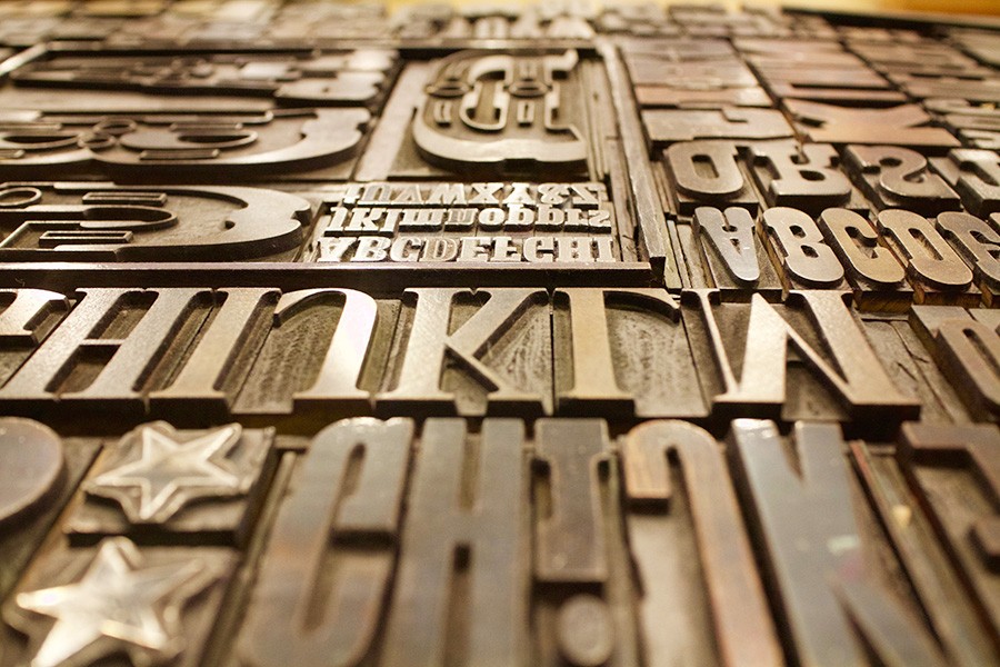
Letterforms are the shape and design of letters in typography. As defined by Wikipedia, a letterform “is a term used especially in typography, paleography, calligraphy and epigraphy to mean a letter’s shape.” Letterforms can be hand-drawn, modified digital type, a font or typeface, and can include several letters numbers or other design elements. A successfully designed letterform can be the perfect logo for a business and can make for an absolutely beautiful brand image.
There are several things to consider when thinking about letters and their appearance. A great resource for understanding the different parts of a letter is the website THINKING WITH TYPE, which shows the anatomy of a letterform among other attributes of typography. Negative space, can strategically be used in letters to form shapes and abstract meanings. Fedex, for example, uses white space in their logo between the capital “E” and the “x” to form a right arrow, a great reference to their services. Color, size, and texture are other elements of design that can be used together to form letters with meaning. Texture can bring a certain feel or description to a logo or design. For example, a tire company could use a tire track texture in the letterforms to express the ruggedness of tires. These different aspects of design used in letterforms are a sure way to impress consumers.